
Saracino Dental Family
The identity of Saracino
Dental Family grew from
a feeling that was already
there: patients felt
at home, welcomed,
part of a family.
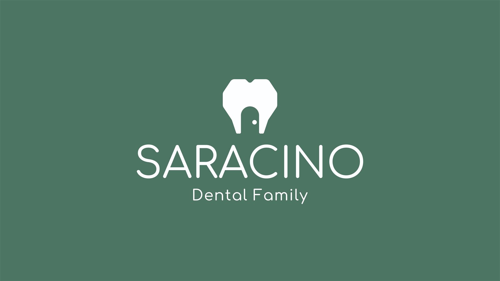
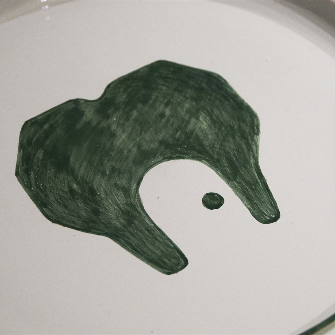
Our work was to turn
that feeling into
identity: from the name
to the logo, a house
as a sign of care,
closeness and trust.
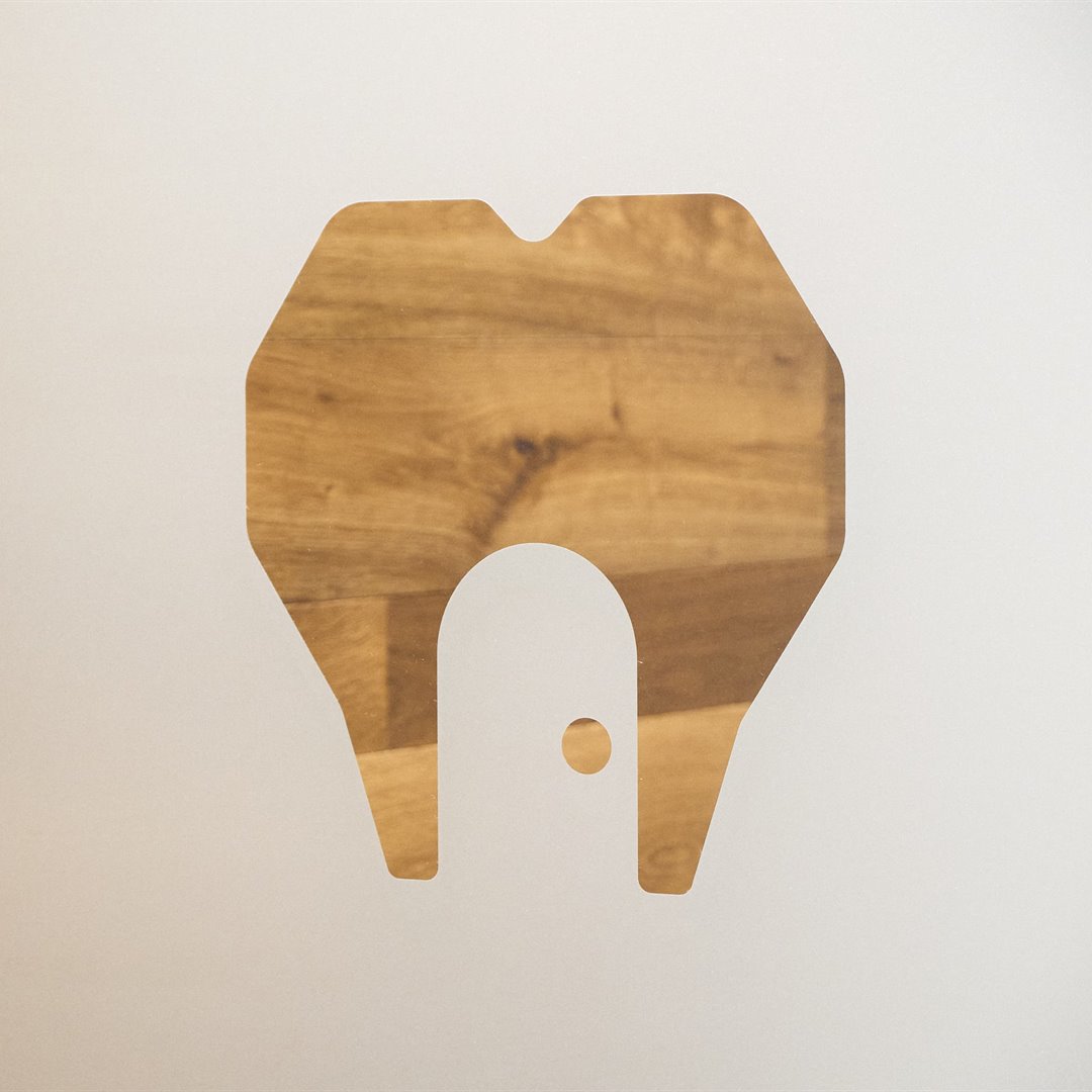
The pictogram joins
a tooth, a heart and
a house with an open
door, drawn from the
words patients left
in their reviews.
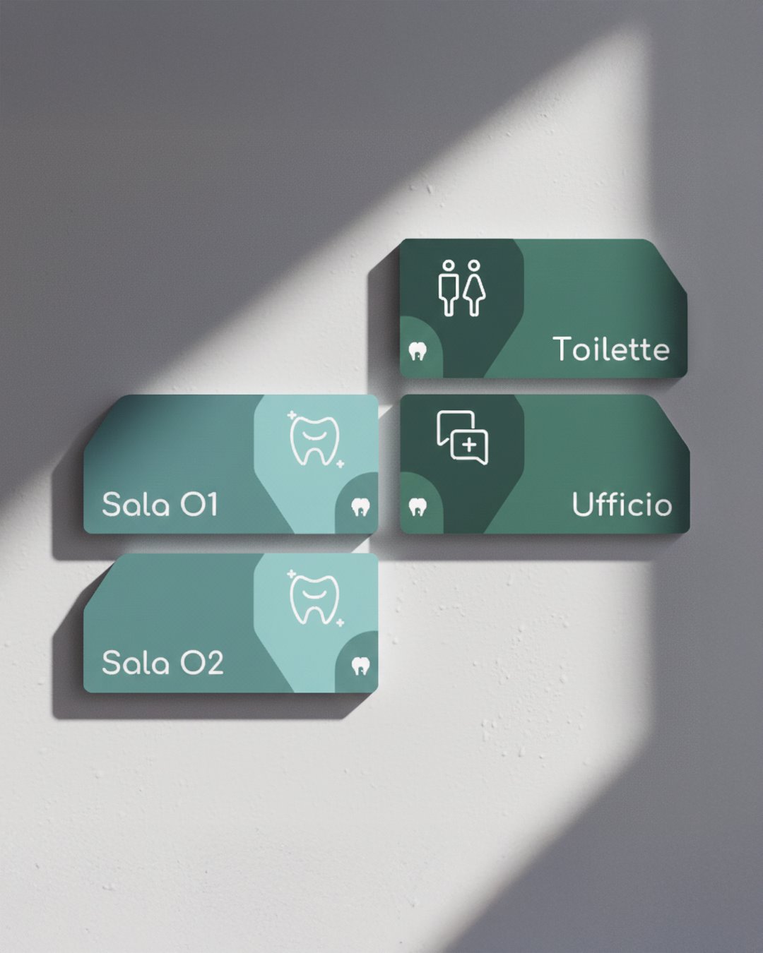
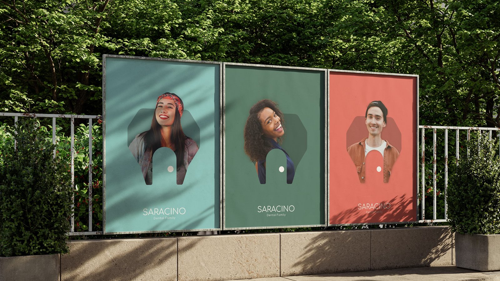
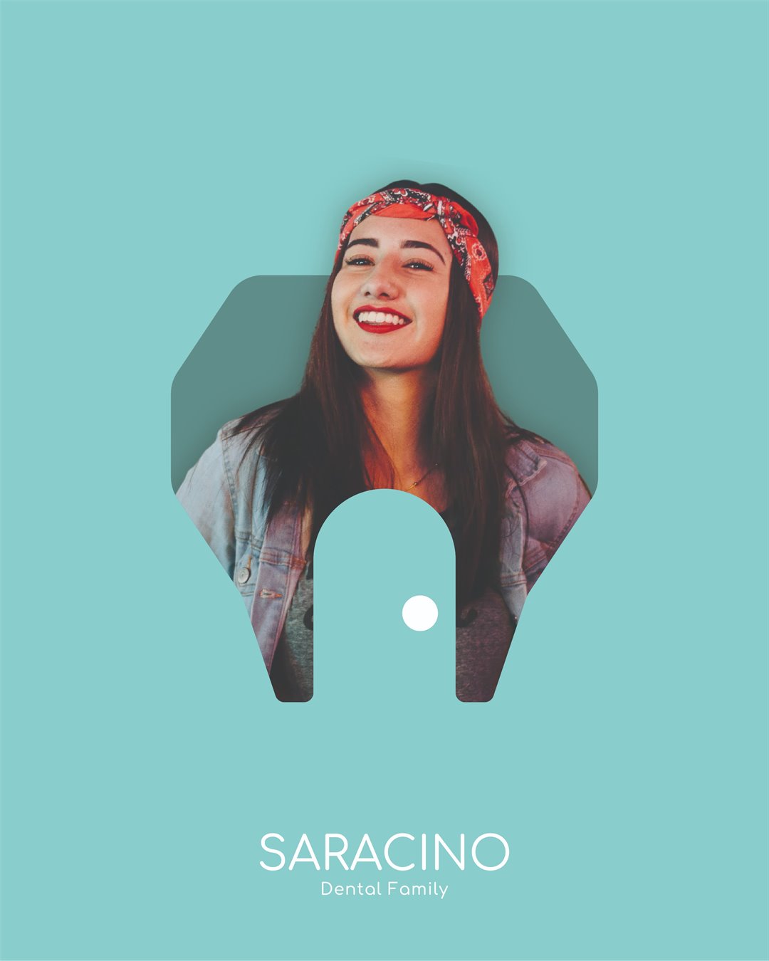
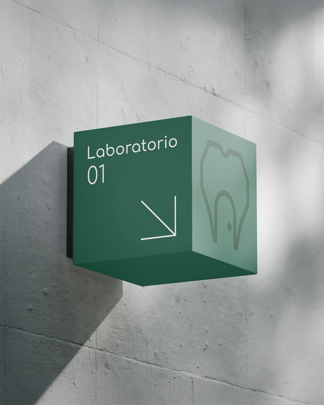
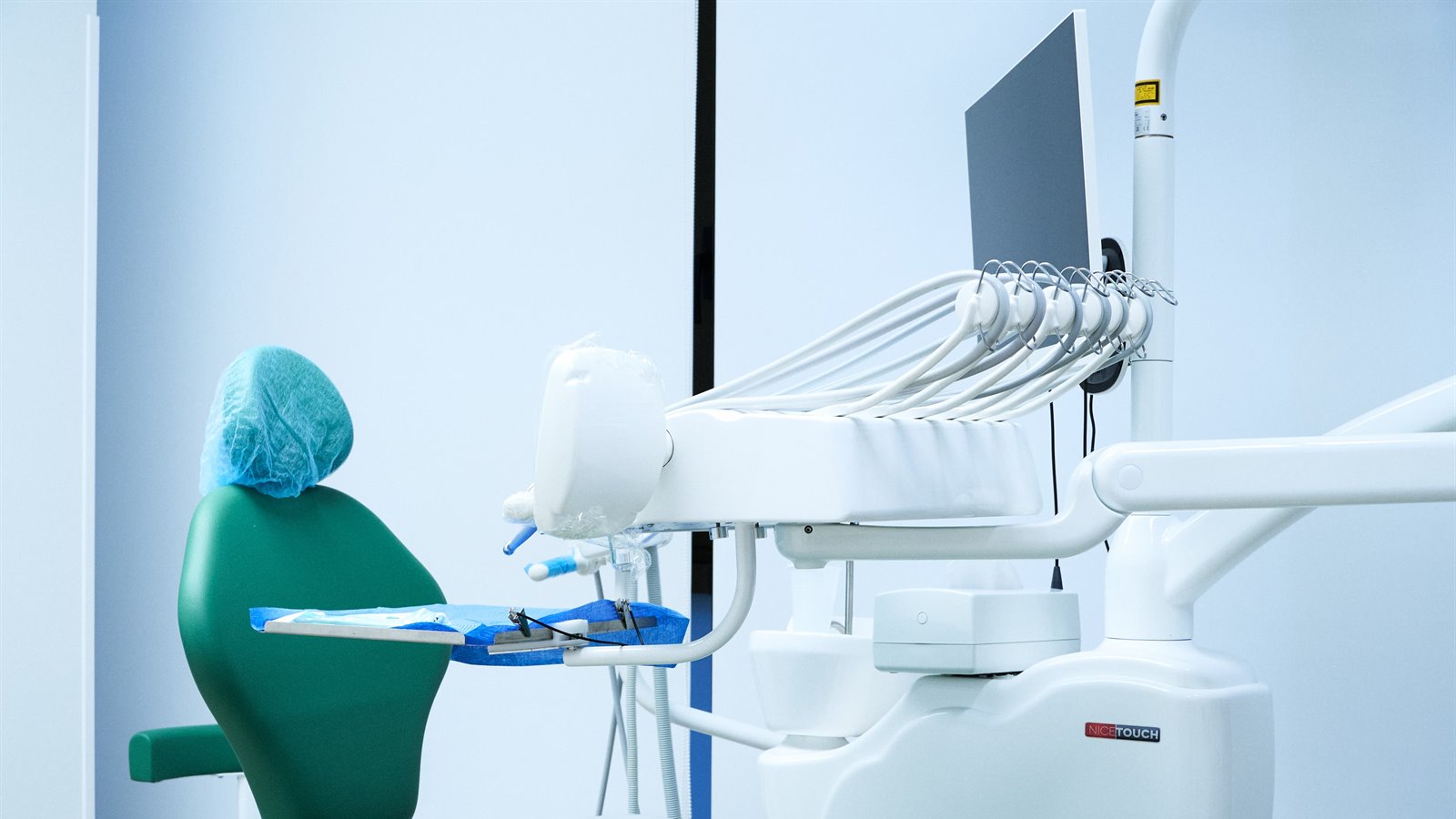
From there, a visual
system that lives in
the spaces: colours,
signage and rooms
that make a real
value visible.
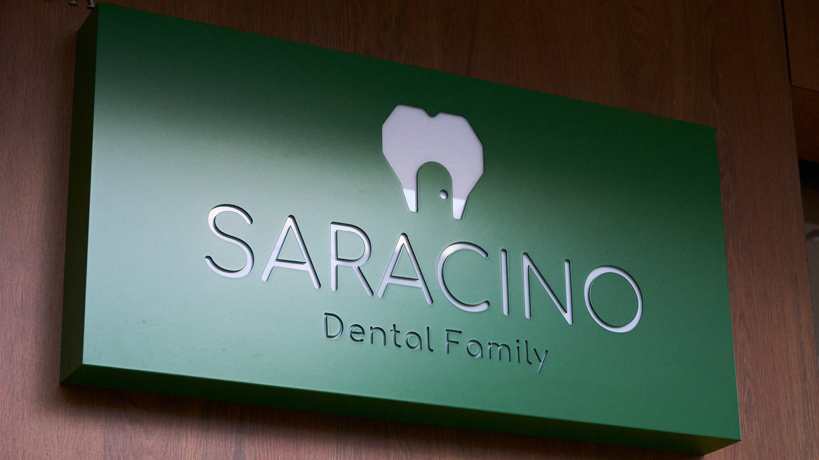
Because branding is not
just a logo: it is how
you are perceived,
how you resonate
with people.




A megaphone
for stories
Would you like to know more?
Visit the Isola Studio page to find
out about the team and our approach.